Case Studies
E.Leclerc Cholet
Products used :
Anti-theft antennas and accessories, totems, checkout lines, guidance, partitions, gates
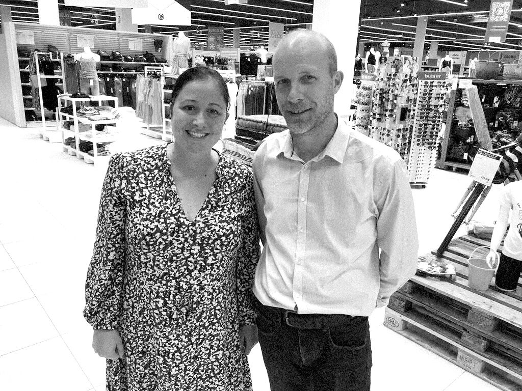
Mr. Arnaud BUGI and Mrs. Justine JADEAU
Members of the Leclerc shop in Cholet
I came to know the Thoonsen company in two ways : the brand of anti-theft I had in mind on the one hand, and my search for EAS tags and fitting manufacturers on the other. The name of the company came up first through discussions and exchanges with other fellow members, notably in SCAOUEST and SCACHAP.
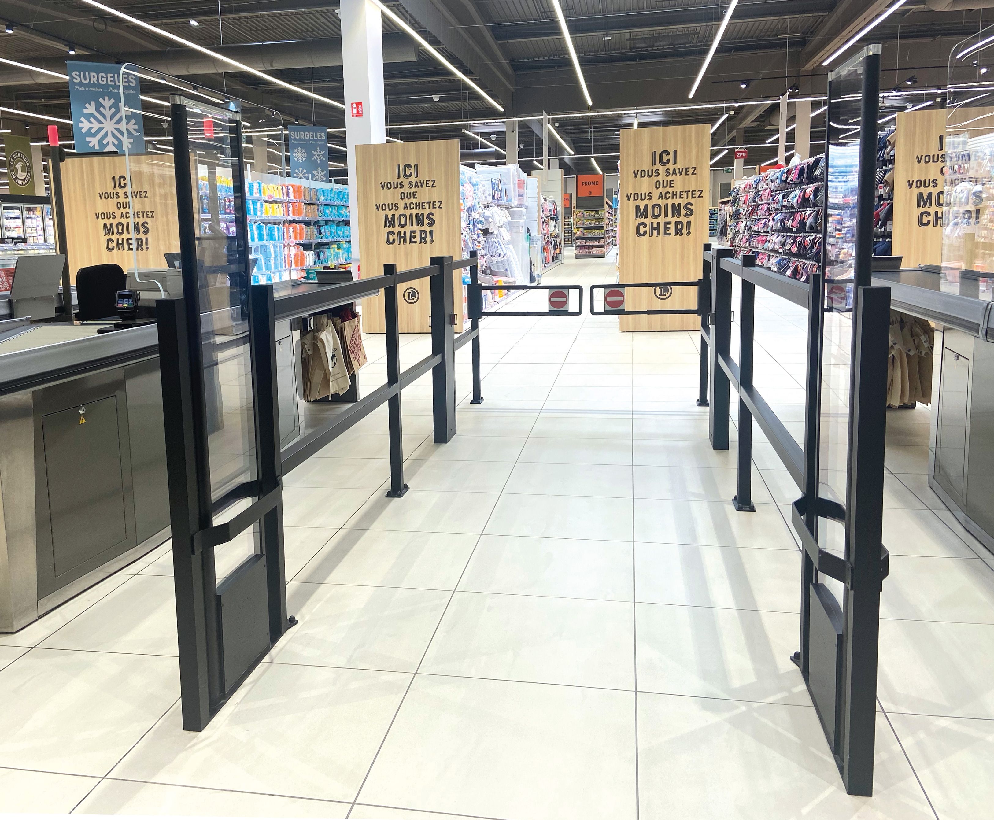
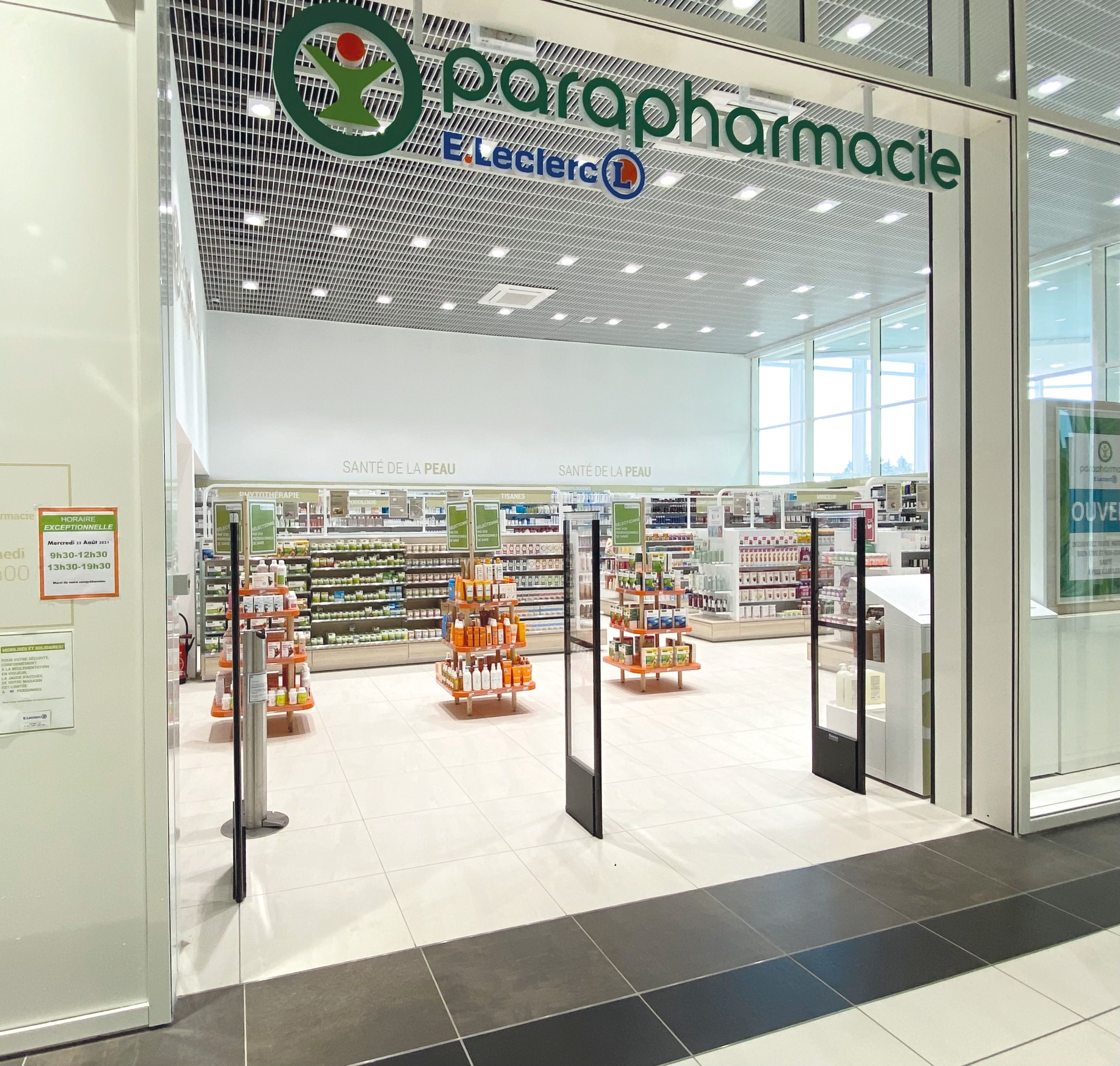
What really made the difference was that Thoonsen met our decorative specifications in every respect. We didn't want round, chrome-plated guides that look un-modern. The square black guides proposed by Thoonsen really corresponded to the look we wanted to give the shop with a modern effect, in the air of time. We were also looking for an overall coherence in the design, and the antennas have this visual sobriety which also interested me.
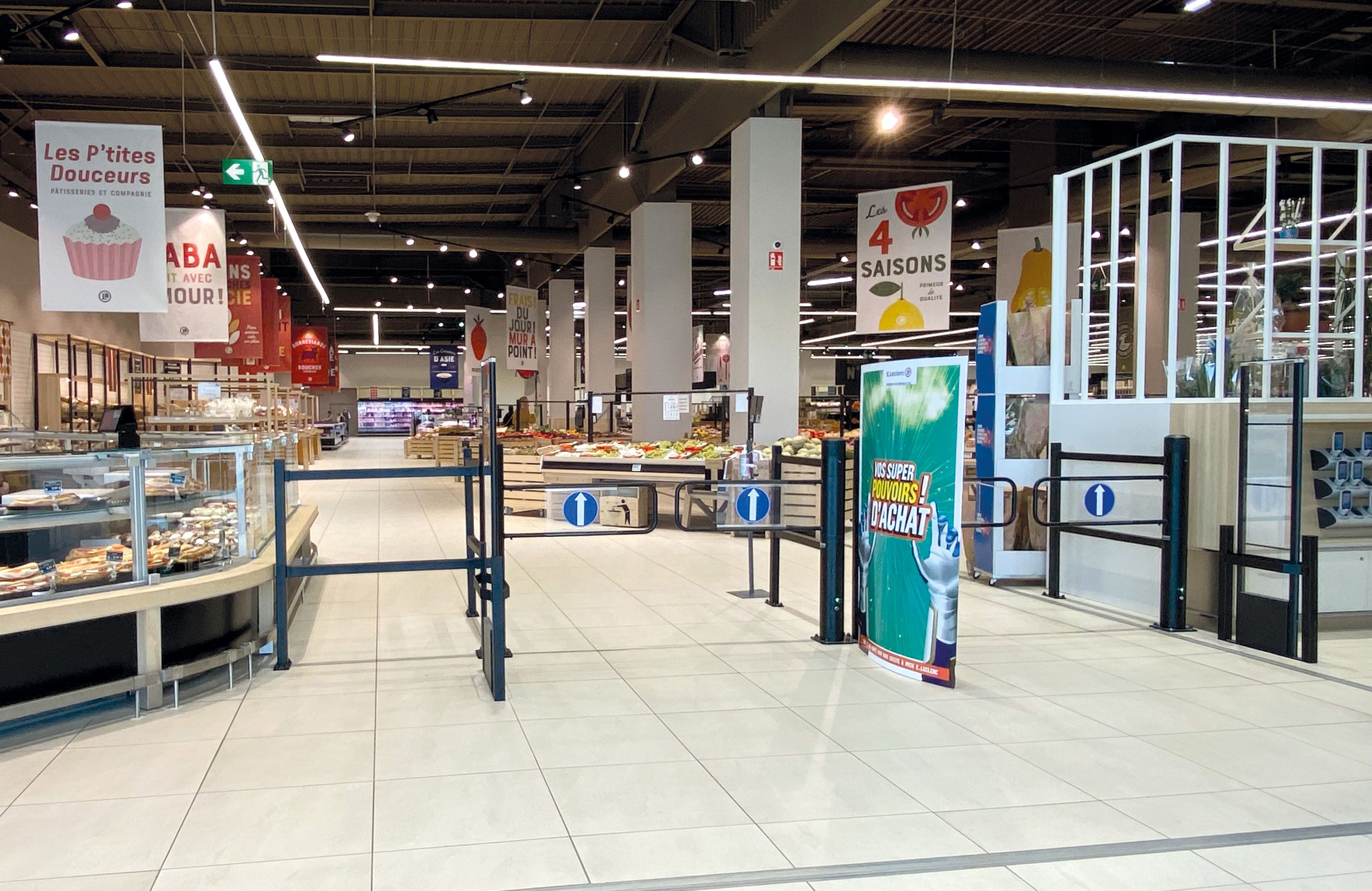
On the purely technical side, the installation was carried out with the very competent Thoonsen design office, which met my expectations well. We succeeded in creating a reception area that is rather atypical in its form, and I am very happy with the way it looks. In addition, we wanted to put gates at the entrance to the shop - a long debate internally ! - and today I don't disagree : the customers are not bothered by it and it doesn't distort the overall visual.
In restructuring, we work a lot on plans, but in reality you have to be able to react and adapt. A very good point for Thoonsen: the technicians are competent, very friendly, listen well and always managed to find solutions. We had to change the checkout line at the last minute because there was a change of service provider. Nevertheless we managed to do it and there was no blockage, it went really well. In the end, our checkout line looks very good and everything works well. The deployment and implementation went very well. We recreated everything from scratch, with the problems of a shop open to the public.
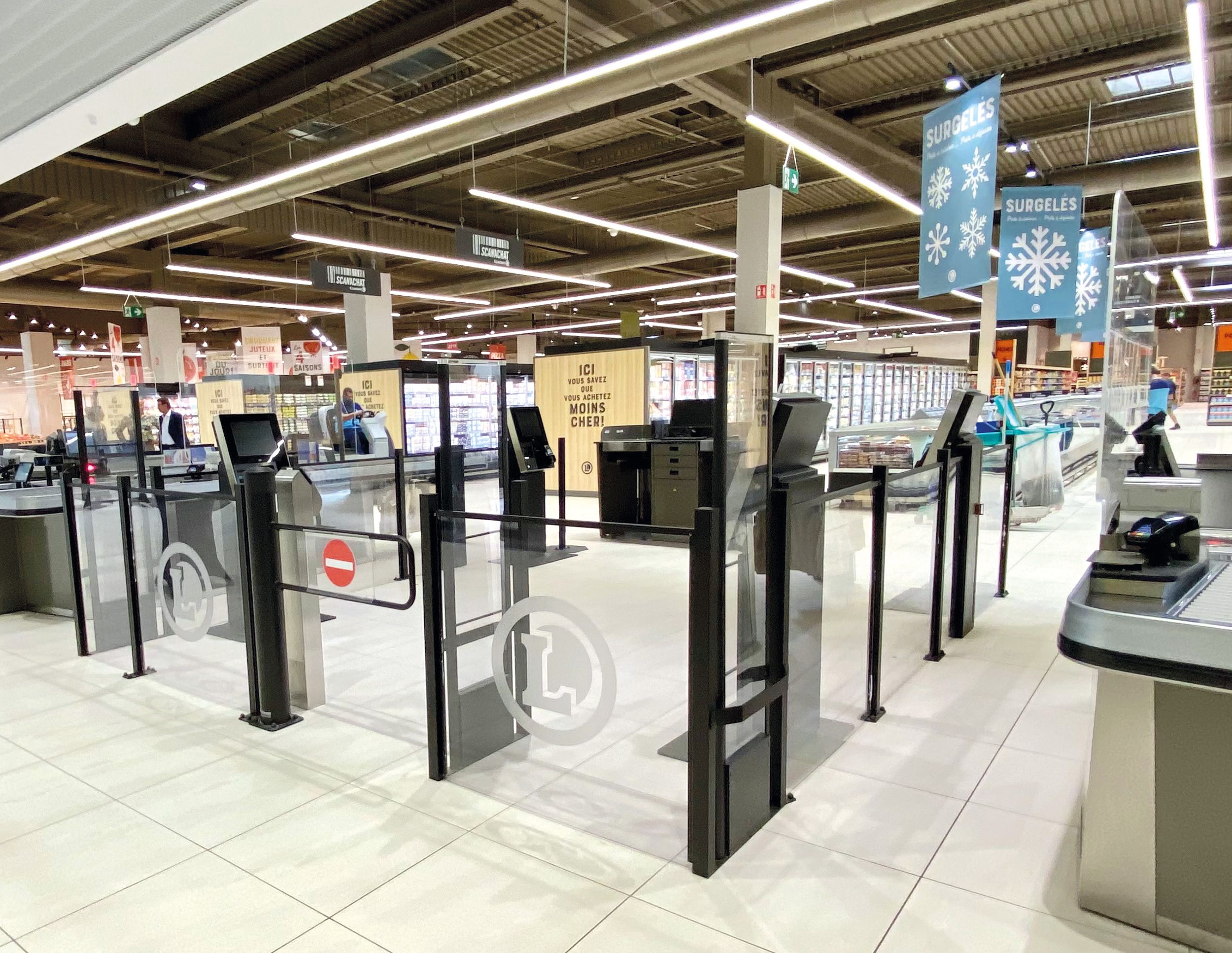
L’espace CLS avec portillon automatique et cloisons.
It was certainly not the best conditions for the realization of works of this scale, nevertheless we succeeded.
Today, we have very good feedback from our customers, who appreciate the visual sobriety (but also the sound, since we don't voluntarily put a lot of volume). It's a choice, we didn't want too many displays and screens. Moreover, all the cashiers appreciate working on this new line of checkout, which is more ergonomic and adapted to their work. And it is really beautiful in the purely aesthetic sense, uncluttered and clean. It's very popular : I regularly get visits from fellow members, who ask me who we've worked with.
We also chose not to put up any light antennas with backlights. Visually it is relaxing, both for customers and employees, not to have aggressive lights. Indeed, we have sought visual sobriety. We listened to Thoonsen's advice regarding the well-being of our cashiers : when they have a spotlight permanently under their eyes all day long, it can be tiring for them. This is in line with a well-being approach for our employees, but also for our customers.
If I had to describe Thoonsen in 3 words, I would say : RESPONSIVE, ECONOMICALLY-POSITIONED, COMPETENT (management, commercial, technicians...). We wish you to keep it that way !


